Monday, May 16, 2011

Character Designs - Michelle


Another batch of character designs. This character's name is Michelle. She's one of Ashley's neighbours. She owns a small shop, which sells mostly hippie/new age stuff, and she's a medium. As in she talks to spirits and stuff. A useful thing to have as a neighbour.

I am slowly slogging my way through location designs. I hoped to have them finished sooner but it's been a slow start. I still think I can have them done by the end of the month. Wish me luck.

Sunday, May 8, 2011

Character Designs - Dark


Hullo. Sorry about the absence. I've spent the last two weeks doing homework, packing, moving, and unpacking again. Which is to say school is done for the year, and I'm back home for the summer. I'm very excited about this because it means I can start on the location designs, which will be taken from my home town. I've finished the character designs, and there's quite a bit of them so hopefully they will keep us posting until the comic is finished.

I don't want to divulge too much info about the character's before the comic is posted, so the next few info sessions will be brief.

This character is named Dark Umbrent. He's Ashley's best friend. He loves rock music and the supernaturel. He spends most of his time playing the bass and watching horror movies.

I'll talk more about his character design and how I came up with it when he's introduced in the comic. Anyways, Adventure Time is on so I have to go now. Thanks for looking!

Friday, April 15, 2011

Character Designs - Ashley


Hello! I have decided to post the finished designs as I go through them. The first thing I'm doing is character designs, and the first character I'm going to introduce you to is our main character, Ashley. You'll remember her from the Ogopogo comic.

I don't want to give away too many details that will ruin the comic, so I will just give you a brief introduction. Ashley is a perfectly normal human teenager. She is 16 years old and both her parents are dead. She is currently "between" foster parents, and has just inherited the house her parents left to her, the one she spent her childhood in. How exciting! What will she do with this outrageous fortune? You'll have to wait and find out!

When I do character designs, I do finalized designs for every costume change a character goes through (unless it's something brief that's only featured in an art or something). Luckily dressing Ashley is very easy. This was the first time I'd ever done a head close up, which was something I did as an afterthought and I'm glad I did it. It helps me work out minor details with a characters face, which helps with expression.

When I do character designs, I also do turn sheets for each costume, head turns, expression sheets, and action poses and of course lots of roughs. I'll probably post these later, after the comic or if I get desperate for content. With Ashley I didn't do a head turn or an expression sheet because I already had those done for the Ogopogo comic (which you can see some pages back.)

That's all for this week, see you later!

Sunday, April 10, 2011

A Quick Update

I just wanted to apologize for the lack of updates for the past few weeks as well as possibly in the future. I'm working hard on the new comic and still figuring out exactly how I am going to post the new content as well as what content to post.

I spent a lot of time posting my roughs here and I don't want to do that again. Although it helped me organize myself I'm not comfortable putting all that stuff for this comic on the internet, and besides, no one wants to see crappy sketches anyhow. And unfortunately right now roughs and concept art is pretty much what I'm drowning in. I'm currently doing character designs and will probably be spending the rest of this month and probably the next doing more designing in general. Because of that I don't have a lot of time for other artwork.

So I'm sorry for the quiet time but hopefully it will be worth it in the end.

In other news I have once again managed to get my deviantart working, so I will be posting some old art there, filling up my gallery with new stuff. If I get anything new and interesting done this place will still be the first place to go.

So once again, sorry. Till next time.

Saturday, March 12, 2011

Ogopogo - Cover


The cover page for My Guardian Demon: Ogopogo. All art and writing by me - Leah Powell.

Ogopogo - Part 1


Here it is! My Guardian Demon: Ogopogo.

Ogopogo - Part 2


This is it! My Guardian Demon: Ogopogo! The comic!

Thanks to everyone who's been reading my boring comic-making posts, and thanks to whoever's reading now. Hope you like it! The pages are to be read in descending order.

Friday, March 4, 2011

Ogopogo - Objects Designs


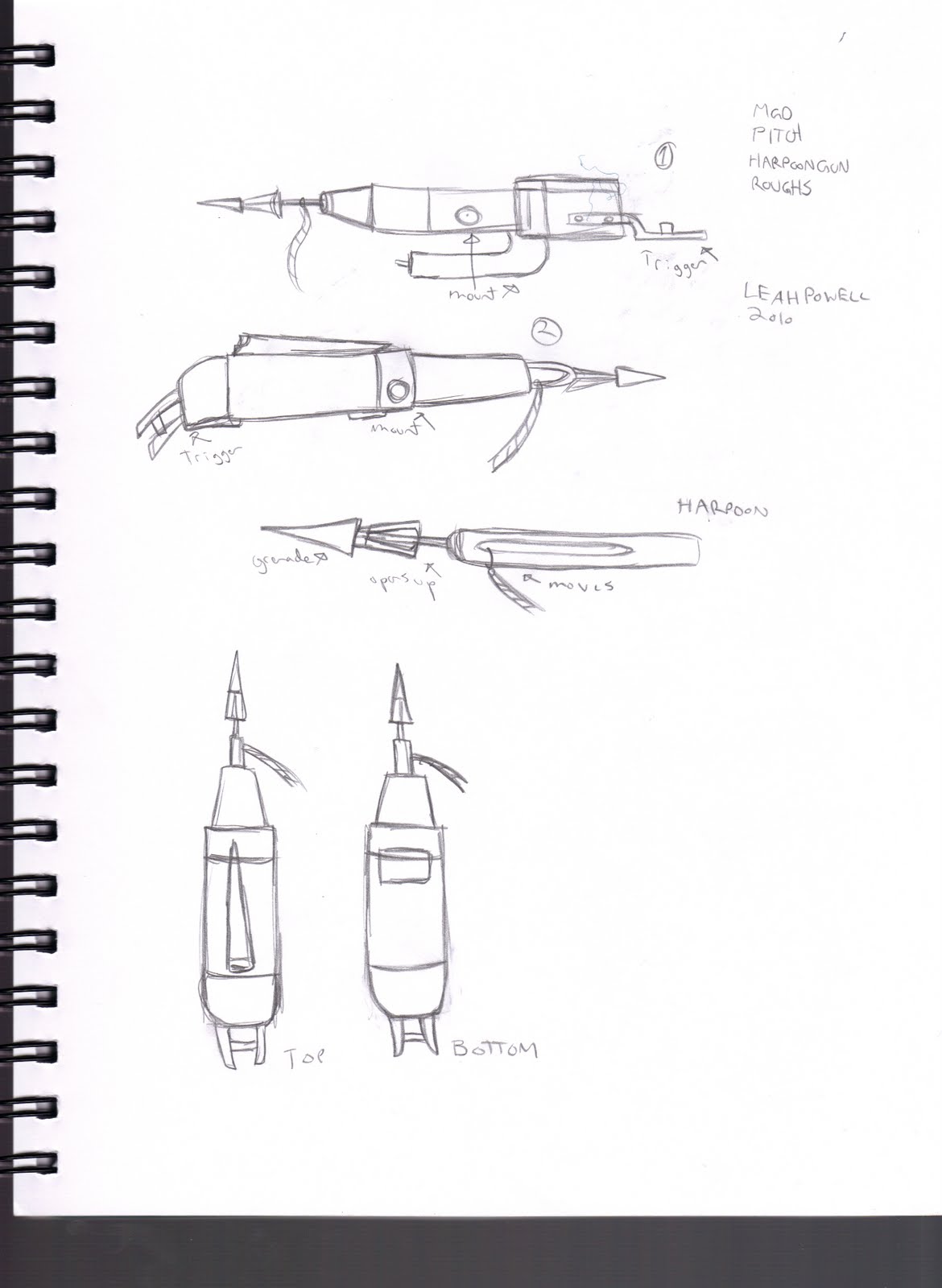
These are pretty boring - just some designs for some of the specific objects that appear in the comic. Obviously not every object that appears needs to be designed beforehand, but the ones that are featured multiple times, seen from many angles, etc need to be. Especially for hard to draw stuff like boats and err... harpoon guns, I like to know beforehand and have something to look off of when I draw them. These were all taken from images I got off google, and redesigned to be more simplistic and easy to draw.
I fudged the harpoon gun quite a bit - Normally they're huge, and need to be mounted to be shot. This one is more like a fancy version of the harpoon bows you can make, which are hand held and very small and probably can't kill a whale. This one also doesn't have a rope attached to it and doesn't explode - I originally wanted it to explode but I just didn't have time for it in the comic. However, the damage these things can do is really bad enough without, you know, a freaking explosion.

Monday, February 21, 2011

Ogopogo Preview Art


A quick "Preview" art for the Ogopogo comic. I did this rather randomly and really quickly a couple days ago, the day I finished the actual comic, I think. I decided to do it when I did a rough image like this (of Daimon climbing out a nasty mouth) for the actual comic, but had to trim it and it lost a lot of its vigor when it actually ended up on the page. I sketched it up all nice and decided to put the titles and dates in because I couldn't think of anything else. It actually scanned in better than it actually looks, I think the colour in the real image ended up too dark to read the letters.

So yes, the Ogopogo comic is all done, all thats left now is a cover which I am doing roughs for while I'm on holidays at home. It will be up some time in March, I just don't know when. Before that I will finish the rough concepts, today I did locations, next week will be objects, after that page roughs and extras.

Location Designs - Lake Okanagan


Here are some rough sketches of the locations and scenery for the Ogopogo comic. There was only one location for this, which was Lake Okanagan in British Columbia, Canada. The lake is obviously quite large, so it's divided up into two minor "sets" one being a general view of the lake, the other being a small cove where the action takes place.

The general view is based on a picture I found on Google. For the comic I trimmed parts of it, removing the mountains in the back and fudged it by putting in a bridge. There is a bridge over Lake Okanagan, just not in this part.

The cove is almost completely made up, I basically assembled it from parts I found in other various Googled images. So no, it isn't an actual part of the lake, but you know, it COULD be.

Monday, February 14, 2011

Monster Designs - Ogopogo Part 2


Just a quick update whilst I rest between working on the last page of the Ogopogo comic! Gotta rest or my back starts to hurt :(

These are the last bits of concept art for the Ogopogo Monster. We've got a final line sketch, a colour drawing and some detail sketches. I think I covered most of what I wanted to say about Ogo in my last post. But to add to the details about him being inspired by totem poles and Native art from British Columbia, I tried to use colours I commonly saw in those things in the colour sketch. This, actually, also made doing him in black and white and greys in the actual comic a lot easier, since I could divide up the three colours easily.

Next week I'm not entirely sure what I'll do, it will either be scenery concept art or I'll just lump all the last bits of concept art together - that would be scenery, objects, and details. I'd like to post up all this stuff before I post the actual comic, but the comic ended up finishing earlier than I expected - which is a good thing, really. Either way, next week.

Sunday, February 6, 2011

Monster Designs - Ogopogo Part 1


I suppose this actually counts as the last character design, since Ogo is technically a character. I prefer to think of it as monster designing, because he doesn't really do much besides destroy stuff and look cool.
This is Ogopogo, the legendary monster of Lake Okanagan. I've talked a bit about him already in my research notes, so if you want to know more about the legends and whatnot, check out those links I posted.
Sightings of Ogo have been rare, but most people agree he is a serpent (as opposed to Nessie, who most agree looks like a plesiosaur). I've collected a few images of popular interpretations, I'll post them after my designs. The most famous is probably the statue of him in Kelowna, which is green and red and really rather silly looking. Obviously, I needed something fiercer than that.

I used the popular art as my springboard, knowing I wanted something colourful, with ridges and horns. I use simplicity as much as possible in my designs, I don't like over thinking my monsters. I want them to be original and interesting, but also easy to draw. Nothing worse than making up a super awesome design for a character and then getting bored and frustrated with it halfway through the comic. I looked to the folklore and artwork of the area I was researching for inspiration. In this case, it was Native art from B.C. and the famous paintings of Emily Carr. So, totem poles. Lots of totem poles.
I ended up with the idea that Ogo was basically just one big mobile totem pole. I liked the idea of him being an armored serpent, having a hard shell-like exterior and being made up of different sections. I made the sections easier to see by putting random designs on them, and symbols I made up.

Next time I'll post the colour images of Ogopogo and some of my cleaner detail designs.

Tuesday, January 25, 2011

Character Designs 2 - Daimon Part 2

Colour Final
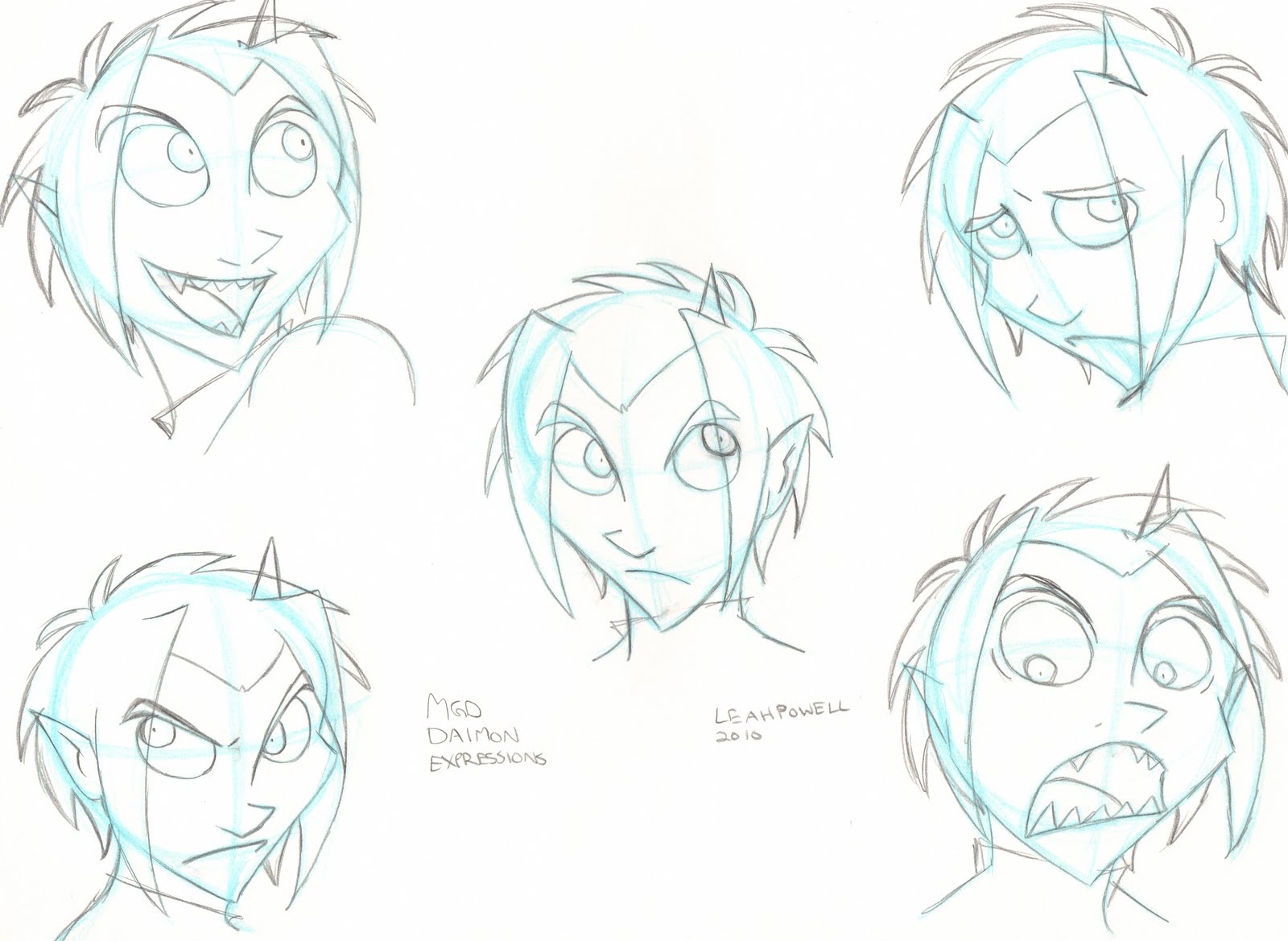
Expressions
Head Turn
Turn Sheet


The final designs for our other main character, Daimon. There really isn't much to ramble on about here, as everything I do I basically covered with the first character. The only difference was that here I had to do a brand new expression sheet, because I had never done one for this character before.

Next I'll be showing the designs for the monster of the story, the Ogopogo.

Saturday, January 15, 2011

Character Designs 2 - Daimon Roughs

Posing Roughs
Posing roughs
Costume Roughs

Updating while I sip tea and watch a snowstorm outside, and be damn glad I don't have to go anywhere today. So this is the second batch of character designs, this time featuring our other main character. His name is Daimon, and he's a demon, and rather easy to get along with.

Designing costumes for Daimon is much easier than for Ashley. For one thing, Daimon never wears colour, so I don't have to worry about matching anything or using the right ones. There isn't really an in-story reason for this... I guess it's just because it looks cool. The only colour Daimon has on him at all is his eyes, which are blue, so if I ever use colour I use a shade of that. When I colour him I usually use blues to shade his hair so it's different than his skin. There IS an in-story reason for all of this but I'm not explaining it now.

He also has a sort of uniform he has to wear. Well, I guess it's not really a uniform, just that his clothes need to be suitable for you know, fighting monsters. So I started with some of the things you usually see him wearing, like a good pair of boots. In these rough sketches and in some past drawings you'll see his boots with these big buckles on the front - I always had them just because I liked the way they looked. But over the years I found that these boots sadly do not exist, at least not in a sensible, monster fighting fashion. So I got rid of them in favour of more realistic strappy ones, and added in buckles on those so they stand out.

I don't usually get fancy with pants on male characters, just because guys tend not to get fancy with pants period. Girls have all kinds of options for what to put on the lower regions but guys pretty much just have pants or shorts. I once again tried to decide on whether to put his pants in his boots or outside, and went with inside for pretty much the exact same reason I did with Ashley: it looked better and made more sense. The belt was a necessity - Daimon always wears this belt on the job. It's like Batman's belt, it's got all kinds of useful crap in it.

The sweater, oddly enough, was where I had some problems. I knew he had to wear a sweater of course, because he's a sweater type of guy and because it was going to be cold on the Lake. I envisioned a kind of millitary sweater - you know, those grey ones with the patchy things on the shoulders? That's what I wanted. But when I drew it, I just didn't like the way it looked. Just goes to show you with costume designing, like with actual clothes, sometimes things look cool on the rack and look terrible on the body. So I went with just a plain grey turtleneck.

Overall, Daimon's costume is rather plain, but has kind of a sleek and sensible feel to it, which suits him. I don't know if I mentioned this when designing Ashley, but I always try to design the two of them to compliment each other - Ashley wears a lot of colour while Daimon has none, Ashley goes for cushy and bulky while Daimon is form fitting. I did some action sketches to see how he looked. Action sketches for Daimon are pretty easy as well, since he fights, so it's easy to pick poses for him.

Next week I'll have the turn sheet, expression sheet, head turn, and colour final for Daimon.

Tuesday, January 11, 2011

Sketchbook 2010 - 2011

A head sketch
A quick colour study

Hey. I'm back from holidays and I just filled up my sketchbook and bought a new one. I thought before putting my old one away I'd show off a bit of what I liked out of the more random, unplanned sketches.
These are both for stories I'm developing but haven't started working on. Unfortunately because of that I'm keeping them both secret and just showing you these sketches.

Hopefully I'll be back on the weekend to continue posting production art from Ogopogo. As of right now I'm finishing up the last minute edits and production stuff, before diving into comic making. School has been pretty nuts already so it's been keeping me a little stuck, but I won't let it keep me much longer.

Thanks, and happy not so new year!

Friday, December 10, 2010

Character Designs - Ashley - Part Two

Ashley in Colour
Ashley's Expression Sheet
Ashley's Head Turn

Ashley's Turn Sheet

Here's the last of the character designs for Ashley. This is all finalized work from the rough - The turn sheet, the head turn, the expression sheet, and the colour. I did these on slightly bigger sketchbook paper - 9X12, save for the colour which I did in my regular sketchbook because the paper was better for colours. They're in non-photo blue with mechanical pencil for the lines, and the colour was done with gel pens, prismacolour markers, and prismacolour pencil crayons.

We'll start with the turn sheet. I do a different turn sheet for every outfit, depending on the variation. This one needed a full turn because it was completely different from the basic outfit I usually draw her in, but if the outfit changed by, say, she took off her hoodie and the only thing I needed to change was her shirt, same pants, I wouldn't do a full turn, just a half one of her waist up. Actually, this outfit does change a bit in the comic, with addition of a life-jacket, which I did just a rough sketchbook turn for. But I'll show that with the other extras. Most animation turns require a three quarter front and back as well, or in place of the full front and back. I prefer to do the fulls because I think they cover more, without any unecessary extras. Plus, drawing the full back is hard, and practice makes perfect. I start with a basic front sketch, then add in my horizontal lines when I'm sure it's the size and placement I want. I do the rest based on those lines, and make changes along the way until it's perfect. This is probably not a good system, as it involves a lot of eyeballing, but it works for me.

Next I do the head turn, which is pretty much the same. I start with my basic sketch, then do the horizontal lines, then follow them for the rest and make changes. With the head turn I do a three quarter shot instead of a full back or a three quarter back. I do this because I think three quarters for the face is especially important, since it's what you see so much, and because for a character like Ashley, the back of the head is very simple and doesn't really need a close-up. I got it pretty much down with the full body turn. If a character has something important or complicated on the back of their head, then I'd show it. I always have rougher sketches of stuff like that if I need them. I also have roughs of her right profile as well, because there's some difference with her bangs and earrings on that side - she has only two pieces to her bangs and two earrings - if the character was the same on both sides I wouldn't bother.

I must confess - this expression sheet is actually old. I did this about a year ago, for a portfolio, and used it because my style hasn't changed much and I was happy enough with what I'd done. Everything else is new. My only gripe is that the drawings are small. Anyways, for most expression sheets in animation they require at minimum five basic expressions - neutral, happy, angry, sad, and surprised. I've of course done millions of expressions for Ashley, but these basic ones for a finalized sheet are good for me. I like to do expressions as warm ups or when I can't think of anything else to draw, starting with these five and variating from there. I'll probably end up doing another sheet for Ashley in the future, I'm never happy with these for long.

And finally the colour. I'm not sure how necessary this was, but I like to have coloured models around just in case. She'll most likely appear in colour in the cover so it'll be usefull then. I just do a basic neutral standing pose and expression. This also helps to give me a solid idea of the texture and details of her outfit, things that might get missed in turn sheets, since they're mostly about shapes. This wonderfully highlights my constant struggle to find the perfect colours for jeans. I wanted these jeans to look old and faded, I think I did a solid job. I'm happy with them.

So that's it for Ashley. Next, the same things except for Daimon, the other main character. Thanks!

Friday, December 3, 2010

Production Art 1 - Character Design Roughs - Ashley

(Ashley Roughs)
(More Ashley Roughs)
(Ashley Costume Roughs)

Hi! The first thing I do after roughing out my comic is production art - character designs, location designs, object designs, and anything else that needs designing, as well as shade testing. I think most people do this before starting any comic stuff at all, but I prefer to wait until I have my pages roughed and script finished because that gives me a better idea of exactly what I'll need to be designing. Of course, you should always have a good idea (a finished, sketched idea) of what your main characters, locations, etc should look like before you start the comic.

I started with characters because I like character designing, and because I already had a lot of stuff already for these characters, all I really needed to do was costume design. I'll show you the base designs for this character next week, this week I'll just show my rough plans. I did these in my sketchbook, with minimal reference. Just enough for the clothes. I've been drawing this character for such a long time that I don't use much reference for her when I'm just doing basic stuff. For clothes and outfits, I like to use Polyvore.com It's good for really simple outfits like this one, but not very useful for more creative stuff, and any kind of mens clothing.

My characters have "default outfits" that I use for art and pin-ups, and when I run out of ideas. But I try not to have them wear the same clothes all the time. I think first of the environmental requirements when designing an outfit. For this one, we're going to be in a lake on a cloudy day. So it would probably be cold and damp. But not too cold, since it's not winter or fall, so no coats. So that leads me to a basic hoodie and pants. Ashley is a very basic character when it comes to outfits. She has personal touches, (like the belt) but is overall pretty usual, which makes finding reference for her easy, since all I have to do is go to the mall. She's the type who always wears jeans, so jeans were a must for the pants.

Finally I had to pick shoes. That's where you see the most variation on the sketches. Ashley usually wears converse shoes, (or at least they look like converse. I'm not a logo person.) but I thought they might be a little too thin for walking around damp forest. Also, they looked a little strange with the way her jeans flared out - the way they scoop back in makes her jean bottoms drag on the ground, which would get them wet and muddy, and I'm sure you all know what I'm talking about. UGH. So I also considered putting her in boots - I came up with a really basic boot design when I was doodling a winter outfit for Ashley. After some reference, I found the design I had looked a lot like UGGs... UGH. But, it fits well enough. I imagine these of course being a much better version, with good soles and warm fuzzy insides and you get the picture. And I stuck the tops of her jeans in her boots, like she would in winter. I ended up liking this a lot better, so it was the one I went with.

I also did a quick extra sketch of what Ashley would be wearing under her hoodie - not necessary but I like to know, just in case. The rest of the little details, like the stripes on her hood and the roundness of her belt buckle were just last minute things I added in to differentiate this outfit from her other ones.

Once I knew which outfit I wanted, I did a couple pages of rough Action Sketches to test her out. I did this to get a feel of how she moves in this outfit, and what she looks like in it, to see if it really suited her. It's like when you see something you love in a store that seems totally you, and then you put it on and its all wrong. Characters have that too! I stuck with fairly basic action poses, and tried to add some in from the thumbnail panels. I tried to get a variety as well - Action doesnt always literally mean... well, action. It basically means dynamic, interesting, with personality. Not Neutral Standing Poses. So I got some of her moving, but also sitting, and standing with attitude.

The outfit came out fitting like a charm. I could imagine exactly how she would move in it in my head, and the only thing I had doubts about - the boots, came out great. They reminded me of the boots all the characters had in How to Train Your Dragon, how huge and fuzzy they were and they just stomped in them. I really loved that.

Next, I moved on to finalizing my clean designs - my turn sheet, expression sheet, and head turn. But, I'll save that for next time! Thanks!

Tuesday, November 23, 2010

Ogopgo - Rough Pages 2


Here are the rest of the rough pages from the Ogopogo story. Hope you like them!